Description
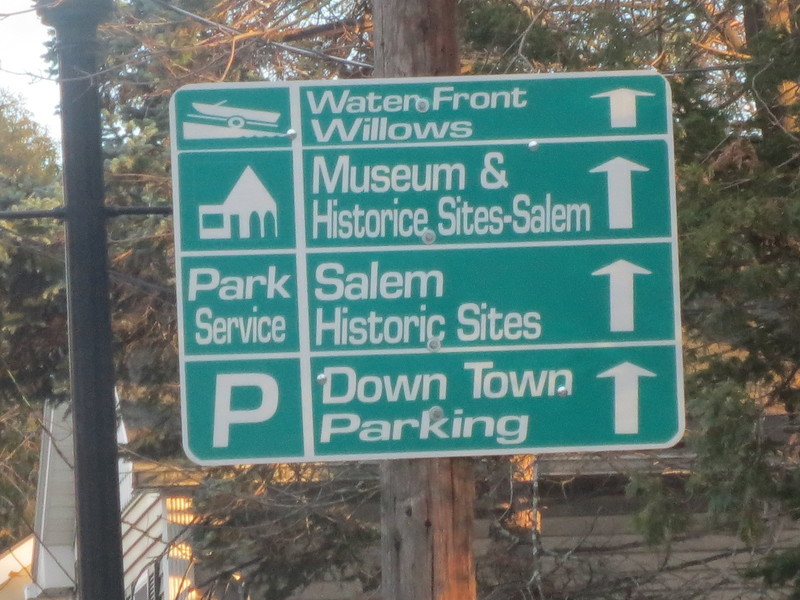
This sign contains a spelling error, odd content, and weird, inconsistent fonts. This makes us look bad to visitors who come from all over to visit our community.
-Spelling error: "Historice"
-Historic sites is listed twice and this is confusing
-The size (both height and width) of the fonts is all over the place
-Italics doesn't look good on any street signs
I am seeing a lot of bad looking new street signs throughout the city lately. The older signs have simple consistent fonts and are not italicized. The city should consider returning to the former standard.
a aussi demandé...
Q. What type of sign is it?
A. Wayfinding
A. Wayfinding
Q. Is this request concerning a new, damaged or missing sign?
A. No Answer Given
A. No Answer Given


20 Commentaires
Display Name Blocked (436405) (Utilisateur inscrit)
CitizenFive (Utilisateur inscrit)
CitizenFive (Utilisateur inscrit)
Bunbury (Utilisateur inscrit)
Samuel (Utilisateur inscrit)
Salem Gorilla (Utilisateur inscrit)
James (Utilisateur inscrit)
churchit (Utilisateur inscrit)
DCP (Utilisateur inscrit)
Nick (Utilisateur inscrit)
Jack (Utilisateur inscrit)
Simon (Utilisateur inscrit)
There are just so many things wrong with this sign.
- The ridiculous spelling error
- The disastrous font scaling
- Downtown and waterfront should not have spaces
- The weird symbols (what on earth is the museum one supposed to be depicting? A pencil? A church with a weird extension?)
- The unevenly scaled, misaligned arrows
- The uneven spacing between the boxes
- The inconsistent rounded/square corners
The signwriter and whomever signed it off should be embarrassed. These signs are cheap and nasty, and make Salem look terrible to tourists.
jimmy d (Utilisateur inscrit)
Concerned citizen (Utilisateur inscrit)
Clos Skipper (Utilisateur inscrit)
Réouvert Skipper (Utilisateur inscrit)
john (Utilisateur inscrit)
Jack (Utilisateur inscrit)
James (Utilisateur inscrit)
Clos Department of Public Services - Director (Membre officiel vérifié)